Reviewing iOS 18 for power users: Control Center, iCloud, and more
Samuel Axon
iOS 18 launched this week, and while its flagship feature (Apple Intelligence) is still forthcoming, the new OS included two significant new buckets of customization: the home screen and Control Center.
We talked about home screen a few days ago, so for our next step in our series on iOS 18, it’s now time to turn our attention to the new ways you can adjust the Control Center to your liking. While we’re at it, we’ll assess a few other features meant to make iOS more powerful and more efficient for power users.
This is by no means the most significant update for power users Apple has released of the iPhone operating system—there’s nothing like Shortcuts, for example, or the introduction of the Files app a few years ago. But with the increasingly expensive iPhone Pro models, Apple still seems to be trying to make the case that you’ll be able to do more with your phone than you used to.
Let’s start with Control Center, then dive into iCloud, Files, external drives, and hidden and locked apps.
A revamped Control Center
Control Center might not be the flashiest corner of iOS, but when Apple adds more functionality and flexibility to a panel that by default can be accessed with a single gesture from anywhere in the operating system—including inside third-party apps—that has the potential to be a big move for how usable and efficient the iPhone can be.
That seems to be the intention with a notable control center revamp in iOS 18. Visually, it mostly looks similar to what we had in iOS 17, but it’s now paginated and customizable, with a much wider variety of available controls. That includes the option for third-party apps to offer controls for the first time. Additionally, Apple lets you add Shortcuts to Control Center, which has the potential to be immensely powerful for those who want to get that deep into things.
When you invoke it (still by swiping down from the upper-right corner of the screen on modern iPhones and iPads), it will mostly look similar to before, but you’ll notice a few additional elements on screen, including:
- A “+” sign in the top-left corner: This launches a customization menu for reordering and resizing the controls
- A power icon in the top-right corner: Holding this brings up iOS’s swipe-to-power-off screen.
- Three icons along the right side of the screen: A heart, a music symbol, and a wireless connectivity symbol
Control center is now paginated
The three icons on the right represent the three pages Control Center now starts with, and they’re just the beginning. You can add more pages if you wish.
Swiping up and down on any empty part of Control Center moves between the pages. The first page (the one represented by a heart) houses all the controls that were in the older version of Control Center. You can customize what’s here as much as you want.
-
The first page resembles the old Control Center, but with more customization.
Samuel Axon -
By default, the second page houses a large “Now Playing” music and audio widget with AirPlay controls.
Samuel Axon -
The third has a tall widget with a bunch of connectivity toggles.
Samuel Axon -
Adding a new page gives you a grid to add custom control selections to.
Samuel Axon
The second page by default includes a large “currently playing” music and audio widget alongside AirPlay controls, and the third is a one-stop-shop for toggling connectivity features like Wi-Fi, Bluetooth, cellular, AirDrop, airplane mode, and whichever VPN you’re using.
This new paginated approach might seem like it introduces an extra step to get to some controls, but it’s necessary because there are so many more controls you can add now—far more than will fit on a single page.
Customizing pages and controls
If you prefer the way things were, you can remove a page completely by removing all the controls housed in it. You can add more pages if you want, or you can tweak the existing pages to be anything you want them to be.
Whereas you previously had to go into the Settings app to change what controls are included, you can now do this directly from Control Center in one of two ways: you can either tap the aforementioned plus icon, or you can long-press on any empty space in Control Center to enter customization mode.
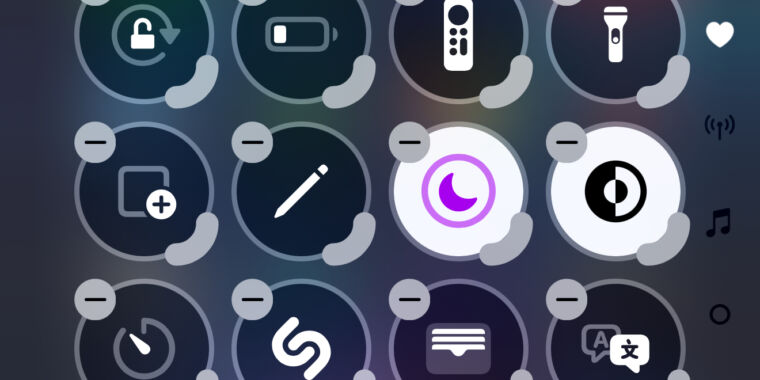
In this view, you’re presented with a grid of circular spots where controls can go. Each control that’s already there has a “-“ button in its corner that you can tap to remove it. To move a control, you just long press on it for a split second and drag it to whichever spot in the grid you want it to live in.
-
This is the Control Center customization view, which is vastly superior to the home screen’s wiggle mode.
Samuel Axon -
Choosing to add a new control brings up this long, searchable, scrollable list of controls from both Apple and third-party apps you have installed.
Samuel Axon -
There aren’t a ton of third-party controls yet, but here are a few examples.
Samuel Axon -
You can resize controls, but most of them just seem to take up more space and include some text—not very helpful, if you ask me.
Samuel Axon
There’s also a marker on the bottom-right corner of each control that you can touch and drag to increase the size of the control. The substantial majority of these controls don’t offer anything of value when you make them bigger, though, which is both strange and a missed opportunity.
To add a new control, you tap the words “Add a control” at the bottom of the screen, which are only visible in this customization mode. This brings up a vertically scrollable list of all the controls available, with a search field at the top. The controls appear in the list just as they would in Control Center, which is great for previewing your choice.

