Excel basics: Get started with charts and sparklines
Microsoft Excel offers a plethora of tools for representing your data visually. The most basic of these — and arguably the most useful — is the humble chart. But it’s not always easy to know where to begin with charts. We’re here to help.
In this tutorial, we’ll get you started using charts and sparklines in Excel, from understanding the basic chart types to creating and editing charts based on your spreadsheet data.
In this article
- What is an Excel chart?
- What are sparklines?
- Common chart types in Excel
- Creating a chart
- Editing a chart
- Using sparklines
What is an Excel chart?
A chart is a visual representation of the data in an Excel worksheet. Charts allow you to easily see trends, make comparisons, and gain insights that are hard to see from just the raw numbers.
What are sparklines?
Sparklines are tiny charts that are placed within a single cell and used to visually represent trends in your data. While charts typically show an entire data set in one diagram, sparklines show a trend in a row or column, so having multiple sparklines on the same spreadsheet is not uncommon.
Common chart types in Excel
Excel offers a large variety of chart types to choose from. These range from popular general styles such as bar, line, and pie charts to highly specialized styles aimed at particular fields or types of data, such as waterfall charts for financial data. In this story we’ll focus on the most commonly used chart types.
Most of the major chart types have several subtypes — when inserting a bar chart, for example, you can choose from among six subtypes: clustered bar, stacked bar, 100% stacked bar, and 3-D varieties of each. For details about subtypes of the common chart types, see this Microsoft support page.
To get you started using charts, here are the most common types of charts used in Excel and when you’d want to use them:
Column and bar charts: These chart types are very similar, with column charts showing values vertically and bar charts showing them horizontally. Both types are best suited for showing changes in data over time or for quick comparisons. For example, the following simple column chart shows total sales year over year.
A column chart is good for comparing values over time.
Shimon Brathwaite / IDG
Line and area charts: These chart types are best suited for showing changes, particularly small changes, over short or long time periods. Line charts show trends with one or more lines stretching across a grid, whereas area charts fill in the vertical spaces between lines with different colors, highlighting how parts relate to the whole. For this example, let’s look at hypothetical changes in a company’s stock price for 2024 in a line chart.
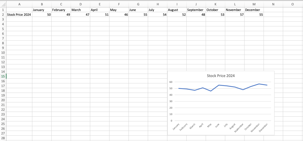
A simple line chart clearly shows small fluctuations in data values.
Shimon Brathwaite / IDG
Pie and donut charts: These chart types show how individual parts compare to the whole and are best used with data sets where no values are negative, zero, or close to zero. Pie charts can show only one data series; donut charts are similar but arrange the data in concentric rings, allowing them to show more than one data series. In this example, the pie chart shows the age ranges of the company’s customer base.
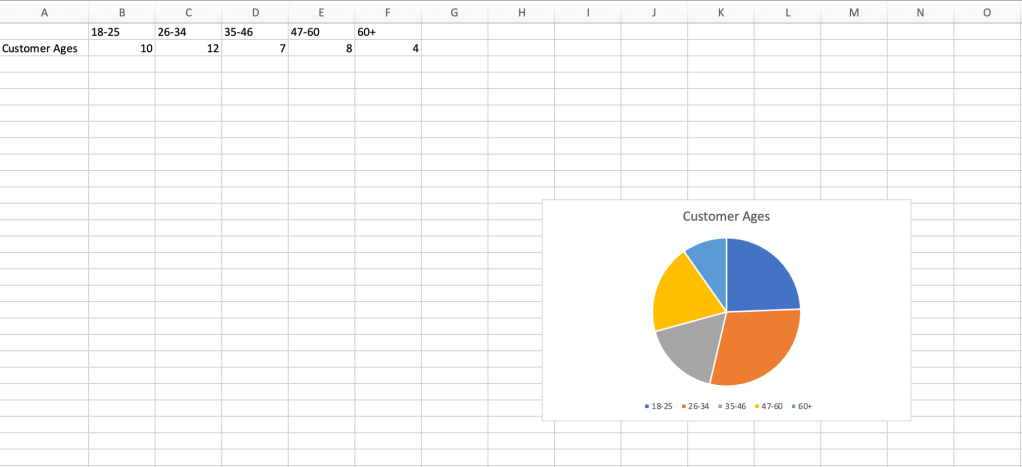
Pie charts are ideally suited to showing portions of a whole.
Shimon Brathwaite / IDG
XY (scatter) and bubble charts: These charts are best used to show the relationship between two variables. For example, the scatter chart below shows the relationship between age and average earned income. Bubble charts are similar but use variably sized bubbles instead of dots to indicate values.
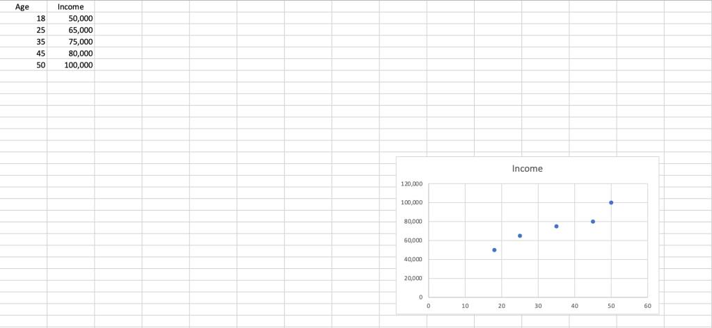
A scatter chart illustrates how one value relates to another.
Shimon Brathwaite / IDG
These are just a few of the charts that Excel supports. To learn about more chart types that you may need for specialized uses, please see Microsoft’s chart types support page.
Creating a chart
Now that you know the basic chart types, we’ll go over how to get them into your spreadsheet. Copy and paste the following sample data set into a blank Excel worksheet if you want to follow along.
| 2022 | 2023 | 2024 | |
| Basketballs | 10,000 | 11,000 | 12,000 |
| Footballs | 8,000 | 12,000 | 14,000 |
| Soccer Balls | 14,000 | 12,000 | 10,000 |
To create a chart from your data set, first select the whole data set, then choose one of the following options:
- Use the Recommended Charts button: The first (and usually best) option for creating a chart is to let Excel suggest which type of chart to use. To use this feature, go to the Insert tab on the Ribbon toolbar and select the Recommended Charts button. This option will examine the data you have highlighted and recommend the best charts to represent it properly. Scroll through the recommendations and choose the chart you want.
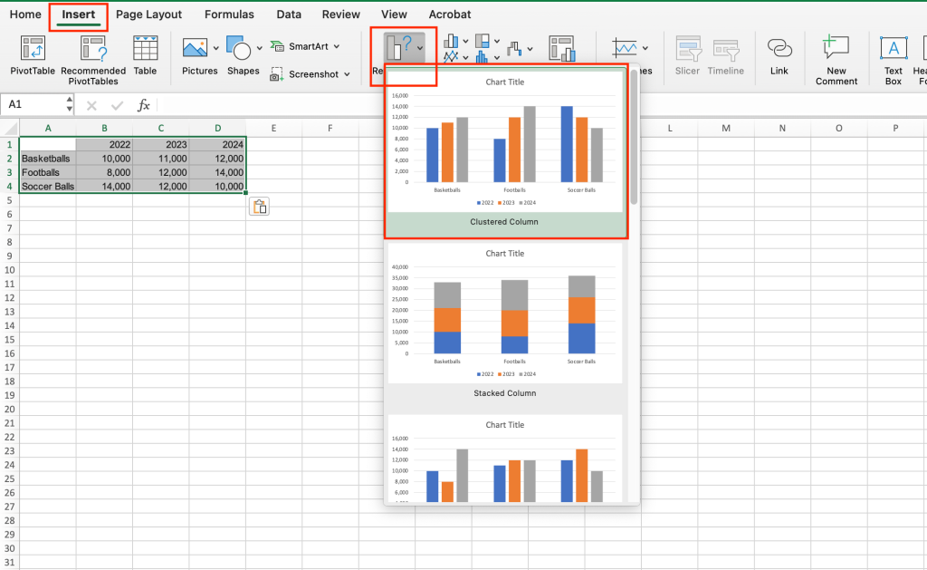
Excel’s first recommendation is a clustered column chart that’s perfect for showing the values in the sample data set.
Shimon Brathwaite / IDG
- Select your own chart type: If you’d rather choose your own chart type, go to the Insert tab and, to the right of Recommended Charts, select the icon for the chart of your choice — in the example shown below, the pie chart icon. A panel will appear letting you choose the chart subtype you like.
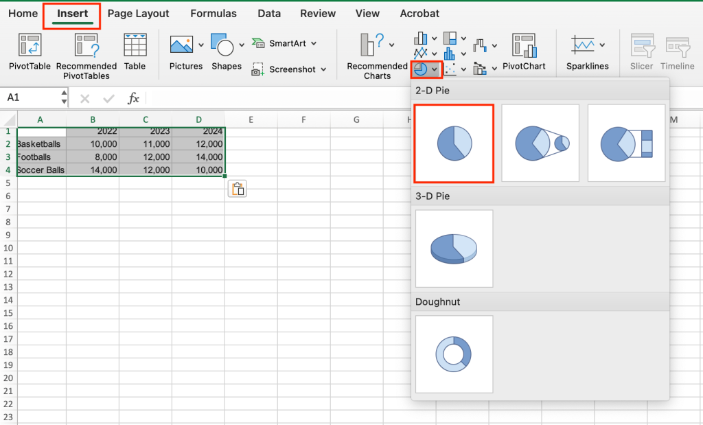
Inserting a pie chart.
Shimon Brathwaite / IDG
- Use the Quick Analysis tool (Windows only): Excel for Windows has a handy Quick Analysis tool that you can use to create charts and more. To use this, simply highlight the data that you want to use for the chart, then select the icon that appears at the bottom right corner of the data. On the pane that appears, select Charts and choose from any of the recommended charts that are present.
Tip: If Excel has trouble understanding elements of your data set — for example, failing to recognize column headers as such — try converting your data to table format first. (See our Excel tables tutorial for instructions.) Then select the table and proceed with one of the options above.
(One more way to create a new chart is to start with one of Microsoft’s premade chart templates and customize it to your liking. But a template is meant to provide a framework for you to fill in with your own data, not something you apply to an existing data set.)
Once a chart has been added, you can resize it by selecting any corner and dragging it to enlarge it. To move a chart on the spreadsheet, click and hold the white space next to the chart title, then drag your chart wherever you would like to place it.
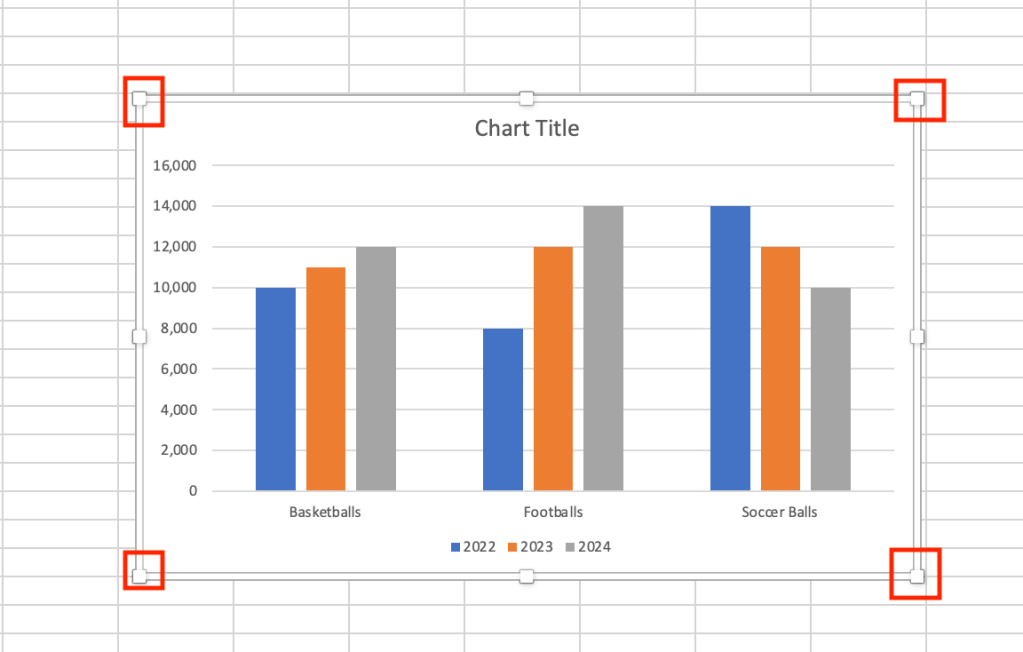
Drag any corner to enlarge the chart.
Shimon Brathwaite / IDG
Editing a chart
Once your chart is in place, you’ll likely want to edit it in various ways, such as adding data labels or changing its formatting. We’ll use the column chart generated using the Recommended Chart option in the previous section for demonstration purposes.
Customize the chart title: Excel typically uses the placeholder text “Chart Title” at the top of the chart, so the first thing to do is change that to something more appropriate. Double-click the chart title and type in a new name. Let’s call it “Sales Data.”
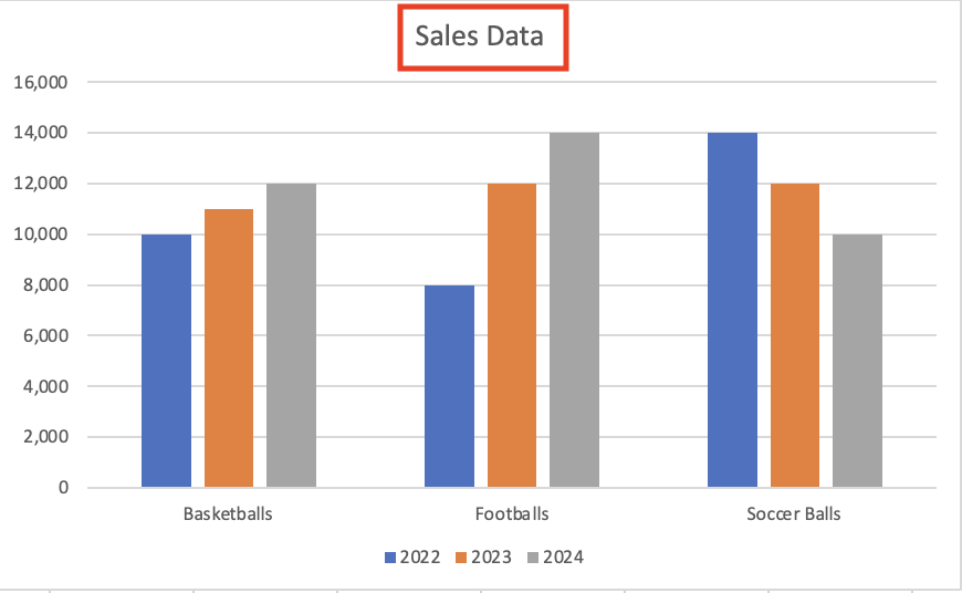
Type in a new chart title.
Shimon Brathwaite / IDG
Change, add, or remove a legend: The legend is the portion of the chart that explains what each column relates to. In our example, the legend has three items: 2022, 2023, and 2024. If you want to change these years, simply select the cell entry that corresponds to that item. For example, if you want to change 2022 to 2021, modify cell B1 and change it to 2021. The chart will auto-update. (Before we proceed with the demo, change 2021 back to 2022 again.)
If your chart doesn’t include a legend, you can add one: select the chart, go to the Chart Design tab on the Ribbon toolbar, click the Add Chart Element button, and select Legend from the menu that appears. Next, choose a location for the legend: Right, Top, Left, or Bottom. To remove a legend if you don’t want one, follow the same steps and choose None.
Add data labels: Data labels add numeric values to a chart, rather than relying solely on visualization. To add data labels, select the chart, navigate to the Chart Design tab, and click Add Chart Element > Data Labels > Outside End. In our example, the numeric labels appear at the top of each column.
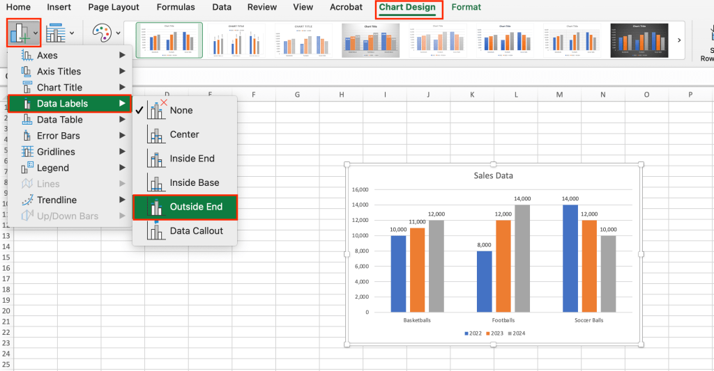
Adding data labels to the chart.
Shimon Brathwaite / IDG
Format chart elements: Multiple chart elements can be changed to create different visual effects. To change the chart’s overall appearance, select the chart, go to the Chart Design tab in the Ribbon toolbar, and choose from among the different designs shown. For our demonstration, we’ll select the design with the dark background.
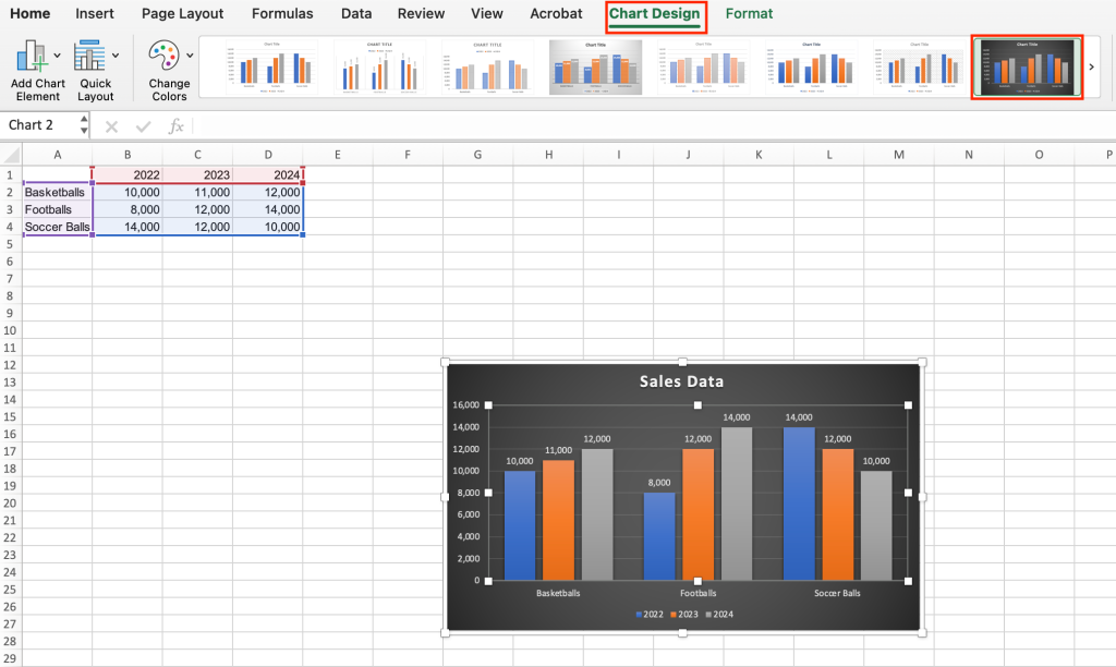
Select a new chart design from the row of options along the top.
Shimon Brathwaite / IDG
To change the colors of the columns within your chart, stay on the Chart Design tab, select the Change Colors button, and choose a new color scheme.
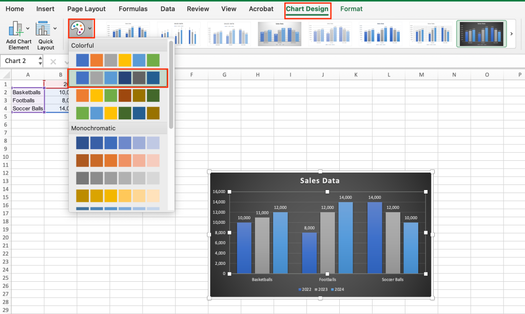
Changing the color of the chart’s columns.
Shimon Brathwaite / IDG
Change the chart type: If you want to see what your data would look like in a different type of chart, simply select the chart, go to the Chart Design tab, select the Change Chart Type button toward the right end of the Ribbon bar, and then select the chart type that you want. In this case, let’s use a pie chart.
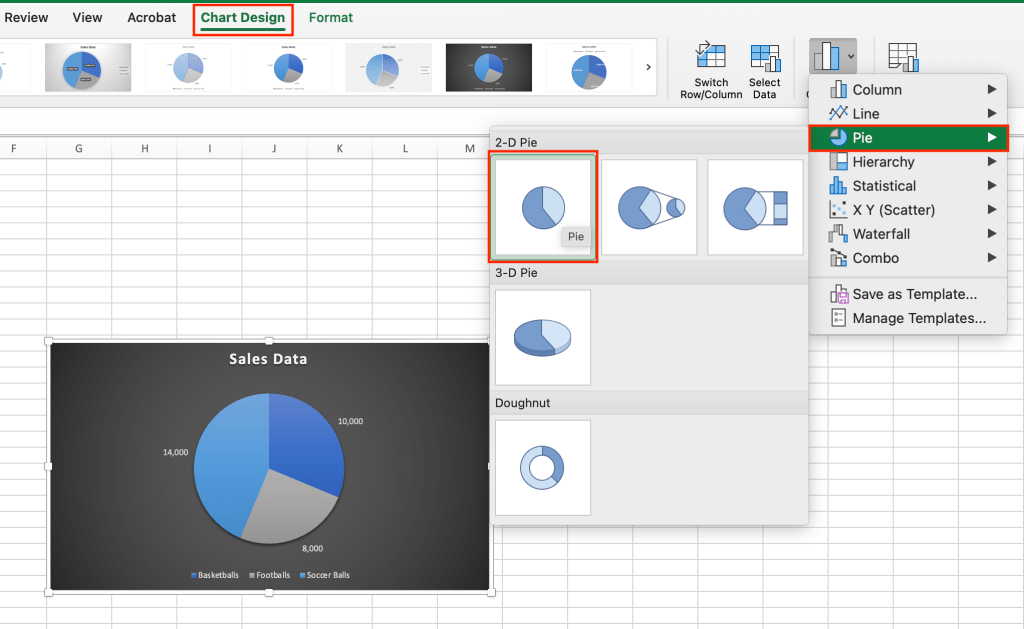
You can use the Change Chart Type option to see how a different type of chart would show your data.
Shimon Brathwaite
As you can see, a pie chart doesn’t suit this type of data well and doesn’t show each product’s years. Undo this change using the Undo button at the top of the Excel window before you continue.
Click Undo to change the chart back to a column chart.
Shimon Brathwaite / IDG
Swap X and Y axes: Excel also has a built-in button for swapping the X and Y axes in a chart, which gives you a different view of your data. To use this feature, select your chart and, on the Chart Design tab, select the Switch Row/Column button. In our example, the chart now groups the data by year, with a column for Basketballs, Footballs, and Soccer Balls within each year group.
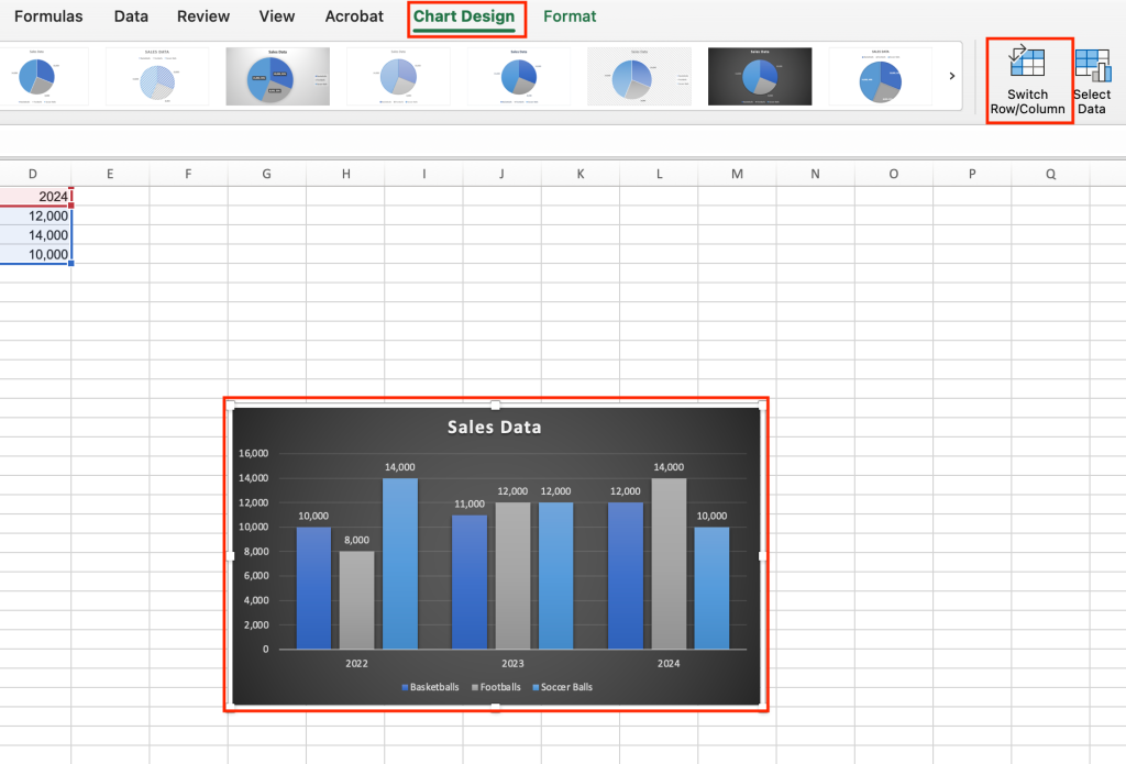
Swapping the X and Y axes in your chart can give you a different perspective on your data.
Shimon Brathwaite / IDG
Note that swapping X and Y axes doesn’t work well with some data sets and might result in a jumbled, hard-to-read chart. If this happens to you when you’re experimenting with charts, simply undo the swap and move on.
Add a trendline: A trendline is simply a line that shows the trend of data in a chart. Starting from our example chart with the X and Y axes swapped (so the columns are grouped by year), select the chart, go to the Chart Design tab, and choose Add Chart Element > Trendline > Linear. On the Add Trendline dialog box that appears, choose Footballs and click OK. A trendline appears on the chart showing the trend in football sales over the three years.
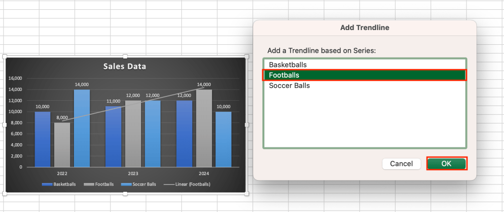
A trendline can highlight a particular trend in your data — in this case, the rise in football sales over time.
Shimon Brathwaite / IDG
Update or filter the data shown in a chart: You can update your chart at any time by modifying the data set from which it is pulled. To illustrate this, go to cell B3 and change the football sales for 2022 to 15,000. You will notice that the chart — including the trendline — automatically updates.
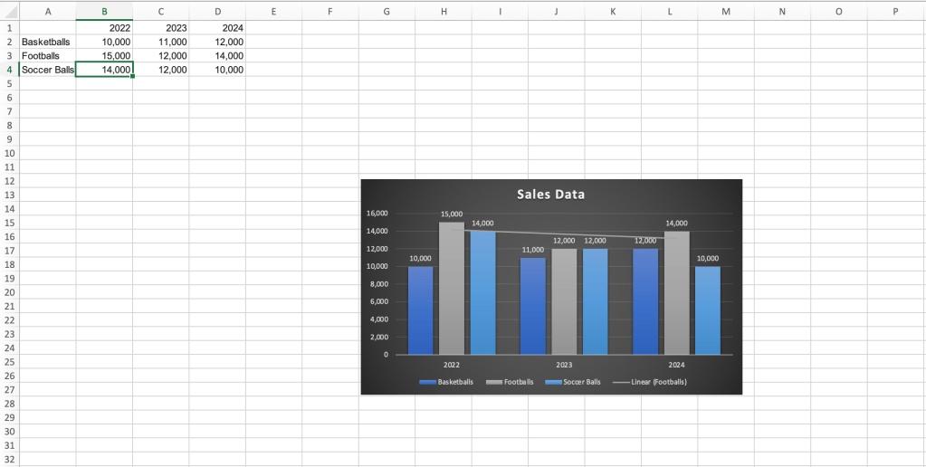
When you change a value in a data set, Excel will automatically update a chart based on it.
Shimon Brathwaite / IDG
If you’ve formatted your data set as a table, you can also filter data from the data set, and these changes will be reflected in the chart you’ve created. The best way to do this is through the use of slicers, which are buttons you can use to easily filter data in Excel. See our Excel slicers tutorial for information about using slicers and charts together.
Add a secondary axis: In some instances, based on the type of data being represented, you may want to have a secondary axis. This can help you highlight how two different types of data series relate to one another, especially if their values are dissimilar.
To see how it works, use the following sample data set to create a column chart using the first recommended chart type (Clustered Column):
| Month | Units | Defect(%) |
| January | 500 | 5 |
| February | 400 | 3 |
| March | 450 | 6 |
| April | 375 | 8 |
| May | 250 | 12 |
The resulting chart shows both “Units sold” and “Defect(%)” columns for each month, but it’s hard to draw any conclusions from the data.
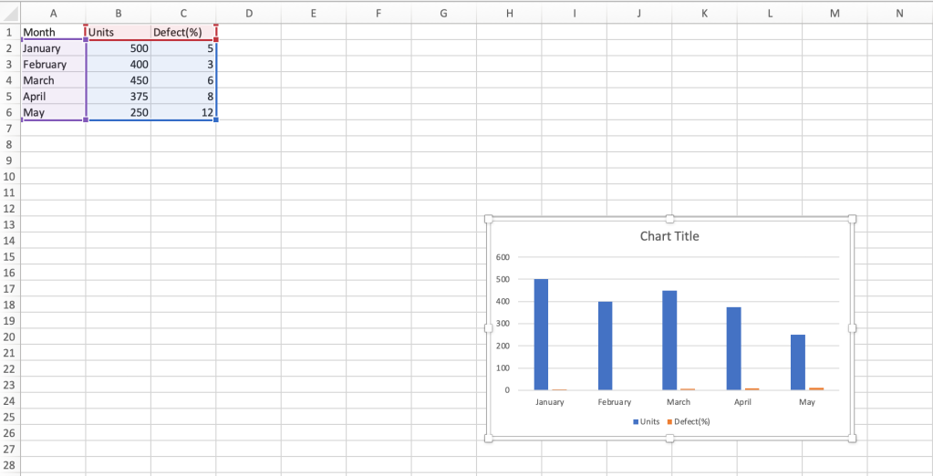
A traditional clustered column chart doesn’t work well with this data set.
Shimon Brathwaite / IDG
Next, select the chart, go to the Chart Design tab, select Change Chart Type > Combo, and choose the second combo chart option. This changes the chart so that the Defect(%) column is graphed as a line with its own secondary vertical axis on the right. Now we can clearly see the correlation between units sold and defect percentage.
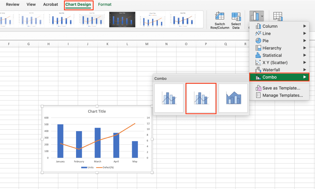
For certain data sets, adding a secondary axis can highlight data correlations.
Shimon Brathwaite / IDG
Using sparklines
Sometimes you don’t need a full chart but simply want to highlight a small trend within the data. That’s where sparklines come in. They’re in-cell visualizations that can show the trends within individual rows or columns within Excel. You can think of them as mini charts for small subsets of your data.
To add a sparkline, select a blank cell where you want to add it — typically at the end of a row or the bottom of a column. In this case, select cell E2. Then select Insert > Sparklines > Line. The Create Sparklines dialog box appears asking you to select a data range for the sparkline. If it’s not already selected, select cells B2 to D2 and click OK.
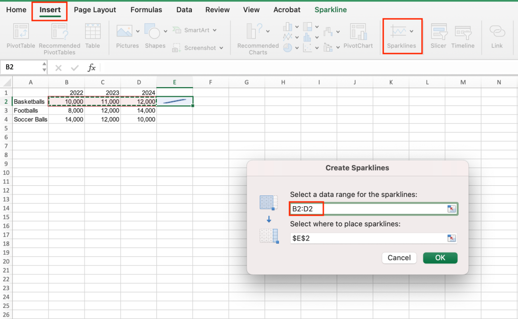
Selecting a data range for the first sparkline.
Shimon Brathwaite / IDG
The sparkline will be added to cell E2. To add sparklines to the end of all the rows, select the green square at the bottom right corner of the first cell, drag it down over all the cells where you want sparklines to appear, and release your cursor.
Sparklines are great for showing at-a-glance trends for subsets of your data.
Shimon Brathwaite / IDG
Now we can see at a glance the trends in sales for basketballs, footballs, and soccer balls.
To edit your sparklines, click on any sparkline and then go to the Sparkline tab in the Ribbon toolbar. From here, you can change the color of your sparklines by selecting another option shown in the toolbar or by clicking the Sparkline Color button. You can also change the sparkline type — for example, from line to column.
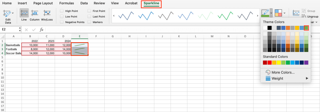
It’s easy to change the look of sparklines.
Shimon Brathwaite / IDG
Sparklines give you a great option for building data visualizations into your data sets rather than creating a standalone chart to summarize or explain your findings.
With charts and sparklines in your Excel toolkit, you’re well on your way to highlighting the most important parts of your data clearly and intuitively.


